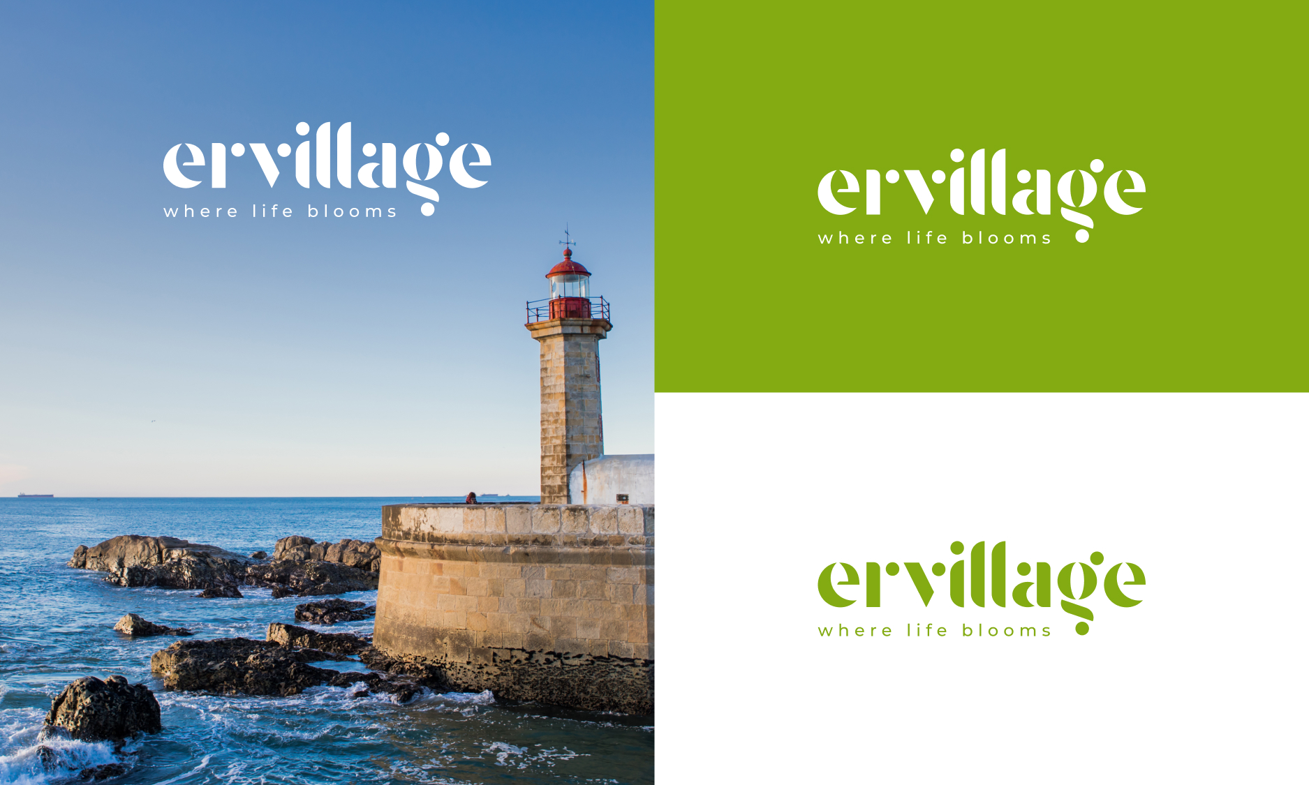
In Porto, where the river meets the sea and nature still shapes the rhythm of daily life, we set out to create something more than just branding for a residential development project, a place with identity, rooted in its landscape, and designed to grow with time.
We began with a famous-named territory, the Ervilha area, in Foz do Douro, Porto. A name as peculiar as it is poetic. A small area where calm prevails and where the land seems to breathe in slow motion.
From there, we asked a simple question: What if a real estate project could feel like something that sprouted, rather than something imposed?
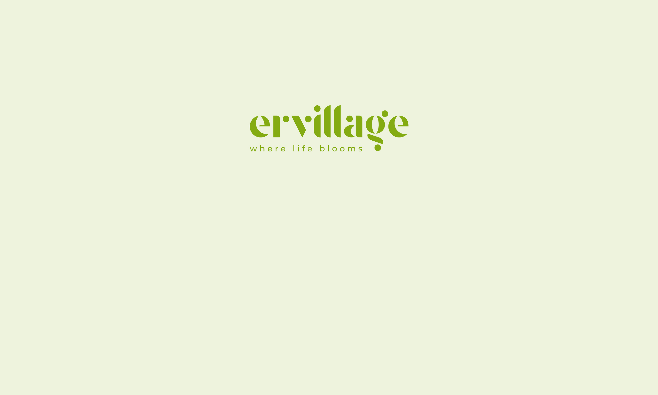
That idea became the seed for Ervillage. A name that merges “ervilha” (pea) and “village” and sets the tone for everything that followed. A “village of peas”, in concept and in form. A place where life doesn’t just exist, it blooms.
The logo carries that idea with intention. Each letter was drawn from the curved geometry of the pea pod, round, soft, interconnected. As if the identity had grown organically, pod by pod, letter by letter.
The color, a soft vegetal green, is more than aesthetic. It’s symbolic. Of life, of simplicity, of quiet sophistication.
“Where life blooms” is the signature that binds it all.
A reflection of a place where architecture respects the land, and living means more than inhabiting, it means thriving, with time, with space, with intention.
Inspired by its place, yet unlike anything else around it, Ervillage is a brand designed to flourish, quietly, beautifully, and with deep roots that will remain timeless.