Conta Lá was born from a simple but powerful idea, Telling Portugal.
A channel created to show the country as it truly is, authentic, diverse, real. No filters, no poses. Like a conversation at the doorstep, or through a screen window. Between the village bell and the phone notification. Between the café and the algorithm. Between what we’ve always been and what we’re becoming.
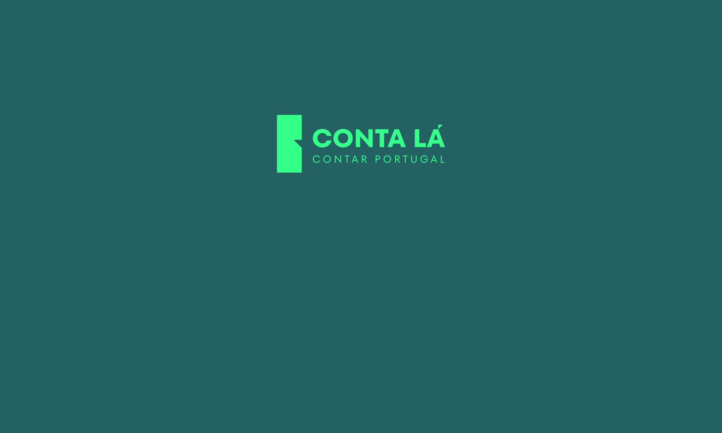
The starting point for the branding was the name itself, Conta Lá. A familiar, warm expression, an invitation to share. And from that action, to tell, came the symbol of the brand. The logo combines a speech balloon, a direct representation of storytelling, with the silhouette of Portugal, the land and identity being told.
The fusion of these two elements creates the perfect storytelling, a brand that literally gives shape to its purpose, Telling Portugal.
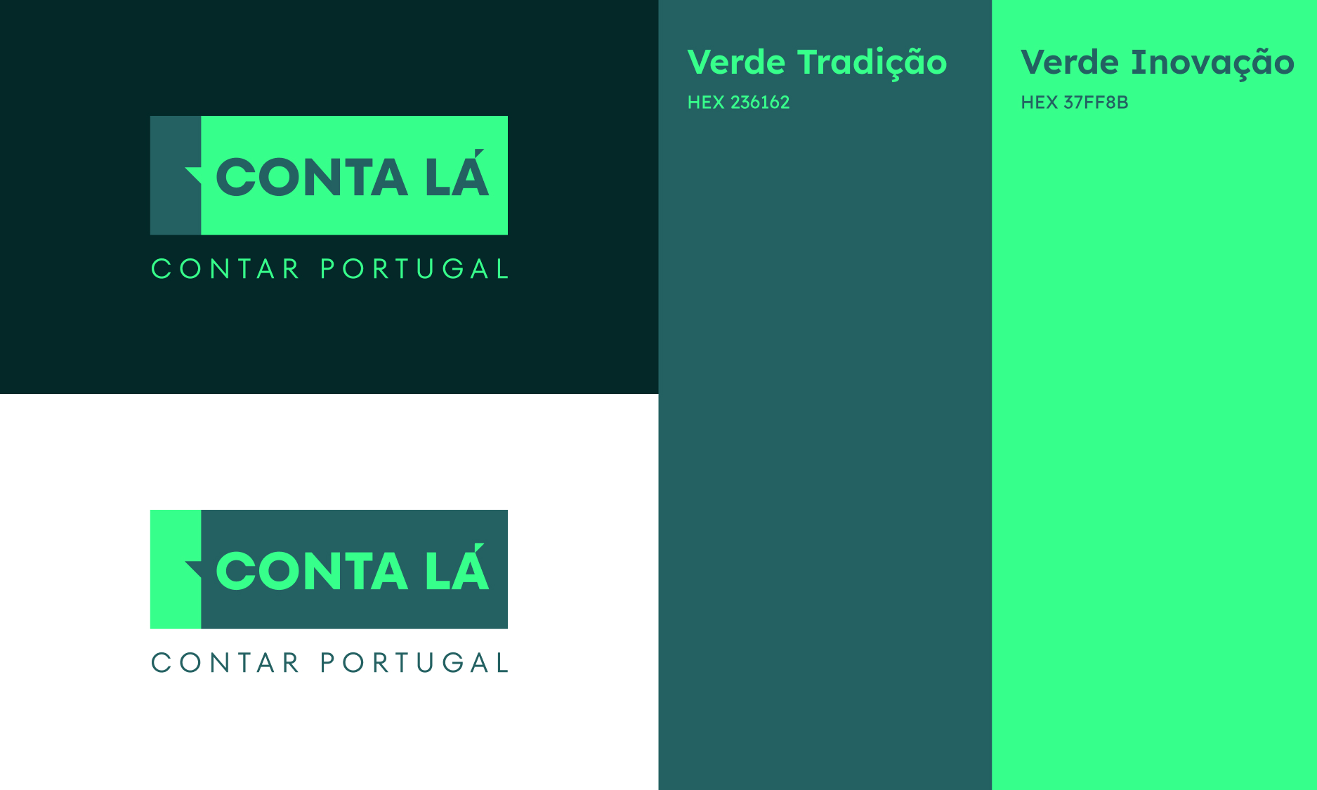
The color palette balances Tradition Green, rooted in heritage, with Innovation Green, pointing toward freshness and the future. The Lexend typeface, modern and highly legible, reinforces accessibility and closeness.
The result is a living brand, one that speaks to the whole country, from North to South, coast to countryside, past to future. More than a channel, Conta Lá is a meeting place. A space where Portugal is seen, heard, and truly recognized.